Sunday, 4 January 2015

POP Artist Locations.

Locations.


I have chosen these locations because these are typical location where either popular artist perform that are at the top of the charts or where famous artists are seen. Also these give me inspirational ideas where i could shoot my magazine images. I was thinking the beach or in a studio, near a telephone box, or near some kind of bridge. This is because i want to get a feel for the music industry and to make it as realistic as possible. realistic stands for crazy but fun atmosphere where anything could happen at that moment of time and it doesn't matter where it is.

Potential front cover, contents page and DPS.

Potential ideas!


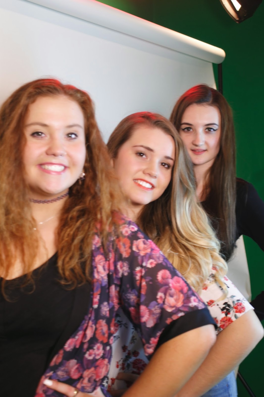
These images are potential photos that i may use in my magazine. Some of the images look funny and fun which is what i am trying to achieve for my magazine. I believe i might use the first image of this collection because it shows the artist singing and that is what my magazine is about, its about music. However i have taken group and duet photographs because i was thinking of placing a twist on to my magazine by showing just one soloist on the front cover but the headline saying ' Does she leave the group/duo or not'? 'Read what happens inside'! This would draw the audience in and leave them in suspense until the buy and read this magazine. Also within the images themselves i was trying to achieve less amount of shadow in the background and more light, also, instead of a still photo i experimented by making my subject move round and dance, sing to a song to show realistic movement within a photo.

Tuesday, 25 November 2014

GOOGLE MOCK UP!

FRONT COVER

This is the magazine i have put together to show what my own potential magazine will look like.  I have used these bright colours because this is what defines the pop genre. I have placed Ariana Grande on the front cover, as because she is a popular artist in the music industry at this moment of the time. The centre of the page is the artist, as because it shows that this magazine focuses on this artist the most. However the font style i have used is too formal which is not what pop genre is all about. 'POP' is about crazy, fun and a laugh. Making this better would be to change the font style.

On this magazine that have constructed, is colours that clash together, this would not attract as many people, as if to colours that don't clash and clear to see in the distance would be more eye catchy. This does have some good features, like the Master head is funky, crazy just like a 'POP' magazine should be. I have chosen a Christmas theme as its the time of year for joy and happiness. Although in the bottom left hand corner is fashion and clothing this makes the magazine messy and no organization, i have decided if i was to include this feature i would place on the front cover  'latest fashion inside' instead of what ive done on this Google mock up. I prefer on this Google mock up how i have designed to feature other story's, although i would only change the position of the image and the writing as the secondary image clashes with the main image. i would put the secondary image before the feature story.

Tuesday, 11 November 2014

Digital mock ups.


These digital mock ups are potential ideas for my magazine, however now i look at them form this prospective it looks like there is too much stuff on them to connect with my kind of genre. It looks wacky and crazy as things go from wavy to straight edges; however in my target research audience they said that they prefer to be more images  to writing. If i was to include long stories then i would make the colours as bright as possible as long as they are readable, however i would try to spread the writing out across the page so it doesn't seem that there is much to read its just miniature paragraphs that contain information about the star that is featuring in this weeks issue.

Monday, 10 November 2014

Behind The Scene Photo Shoots!

What I have analysised in this mood board is that creating pop genre magazine includes a lot of fun! Also when taking my shoot for my magazine , I have learnt through this mood board is to be creative and funky in my shoot , as well as, getting the subject to move well having the photos taken to show natural movements within a persons reaction to things. This can add some realisim to my front cover and make it look !ore proffesional.